Catalyst brand
Building a brand for the product Catalyst would become
Companion to the Catalyst product case study.
I led the naming and built the identity for Catalyst, creating a distinct brand that extends Socialive and scales with the product’s expanding vision.
- Team
- Brand designer I directed, with leadership and stakeholders across product, go-to-market, sales, and marketing
- Timeline
- 2026
- Outcome
- Approved in one leadership meeting with minimal changes. Activated across social, web, product, sales, and events.
Building for what’s next
Catalyst started as an AI video creation tool, but its roadmap extends much further: planning, orchestrating, and measuring video production.
A feature name under Socialive couldn’t support that ambition. The product needed a distinct brand that could grow with its capabilities while remaining connected to the parent company.

Finding the name
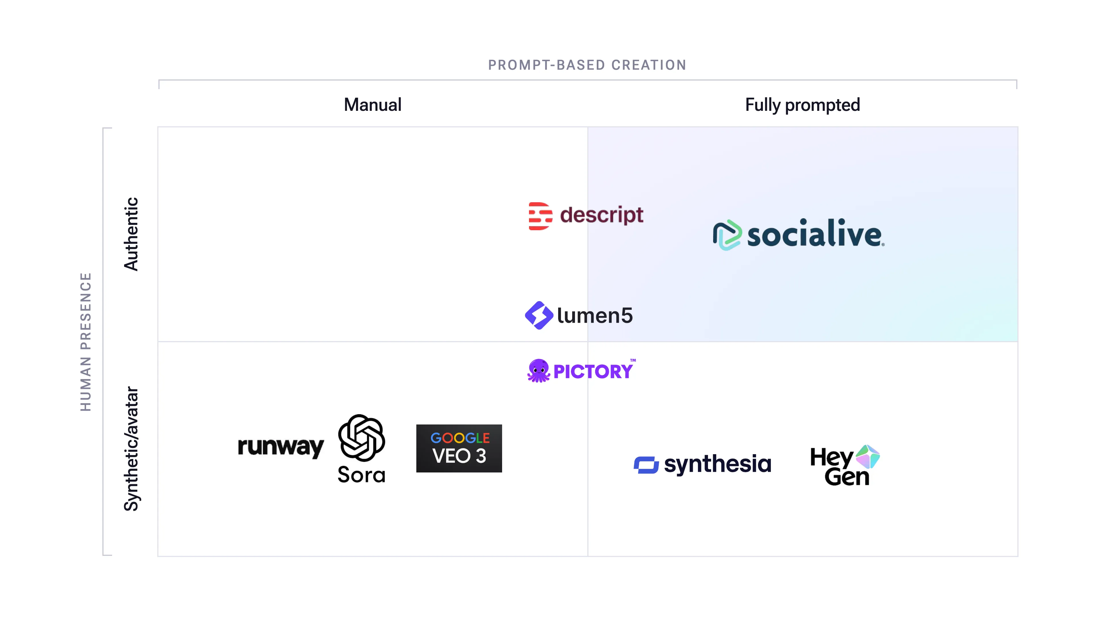
I mapped the competitive landscape across two dimensions: how much creation was automated, and whether videos featured real people or avatars. Catalyst occupied a distinct space: AI-driven creation built around authentic human presence.
Most competitors also relied on generic, descriptive AI names. I wanted something distinctive, memorable, and broad enough to represent a flagship product.
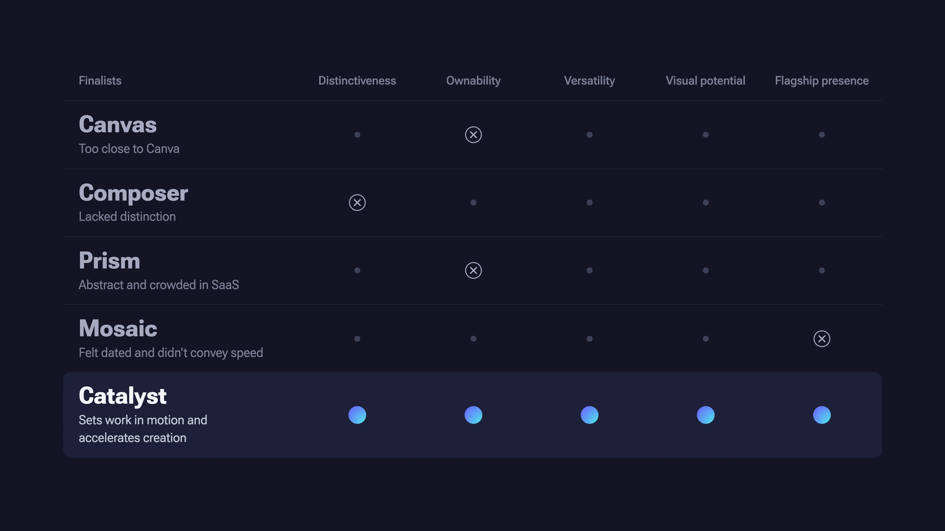
I led the naming process with leadership and key stakeholders, having everyone bring ideas to the table before we evaluated them against the same criteria: distinctiveness, ownability, versatility, visual potential, and flagship presence.
We narrowed the options to five finalists. Canvas was too close to Canva. Composer lacked distinction. Prism was abstract and crowded in SaaS. Mosaic felt dated and didn’t convey speed.
Catalyst was the strongest fit. It describes what the product does: sets work in motion and accelerates creation without replacing the people behind it.
Designing the identity
I directed a brand designer through broad exploration before we narrowed to one concept and developed the system together.
The brief had three priorities: create an ownable identity for enterprise buyers, convey the product’s power without relying on generic AI tropes, and build a system that could expand with the roadmap.

The Spark became the core mark: four nodes radiating from a central origin. The connections represent orchestration, with separate parts working together. The center represents creation, where a prompt, file, or idea becomes a video.
A shared grid makes the icon family extensible. New capabilities, from script writing to brand creation, can use the same visual language without requiring a new system.
A wordmark set in Socialive’s primary marketing font completes the identity. It’s direct and uncomplicated, letting the symbol carry the distinction.
“I immediately loved this visual identity. Something about it feels familiar, but also cutting edge. It’s perfect.”
Extending the Socialive brand
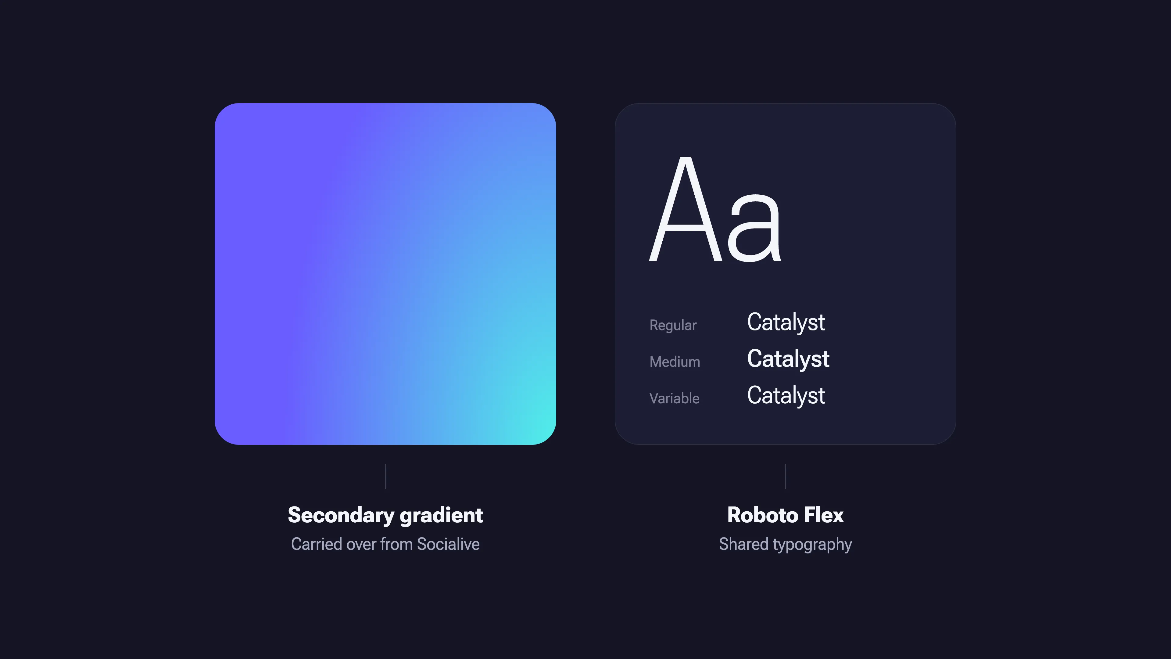
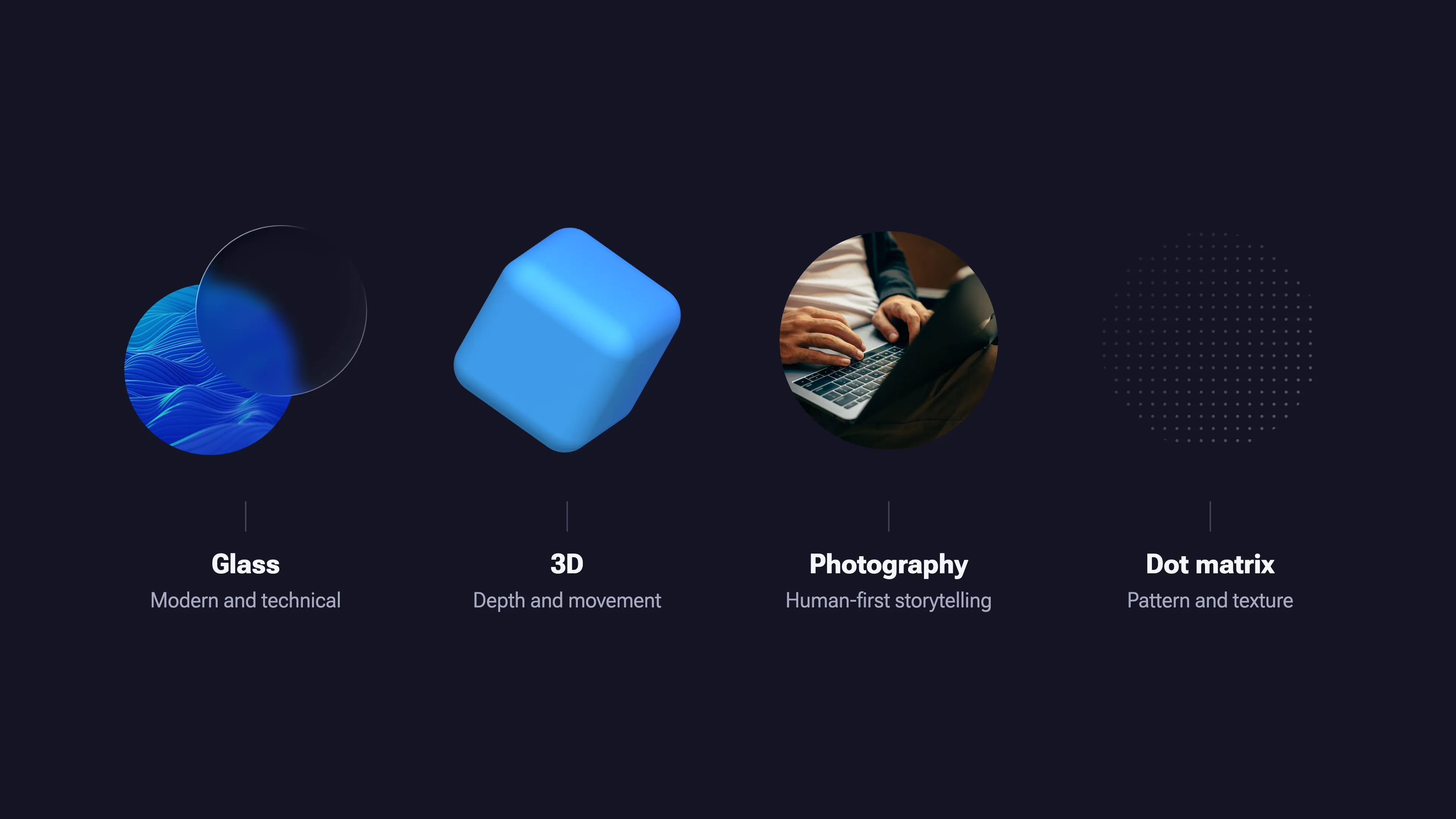
Catalyst builds on Socialive’s typography and secondary gradient while introducing its own visual language.
Glass adds a modern, technical quality. 3D creates depth and movement. Human-first photography keeps the brand grounded in authentic storytelling.
The result feels connected to Socialive without looking like another feature within it. Catalyst has room to become a platform in its own right.
From approval to activation
I presented one concept in one leadership meeting. It was approved with virtually no changes before being introduced to the wider company.
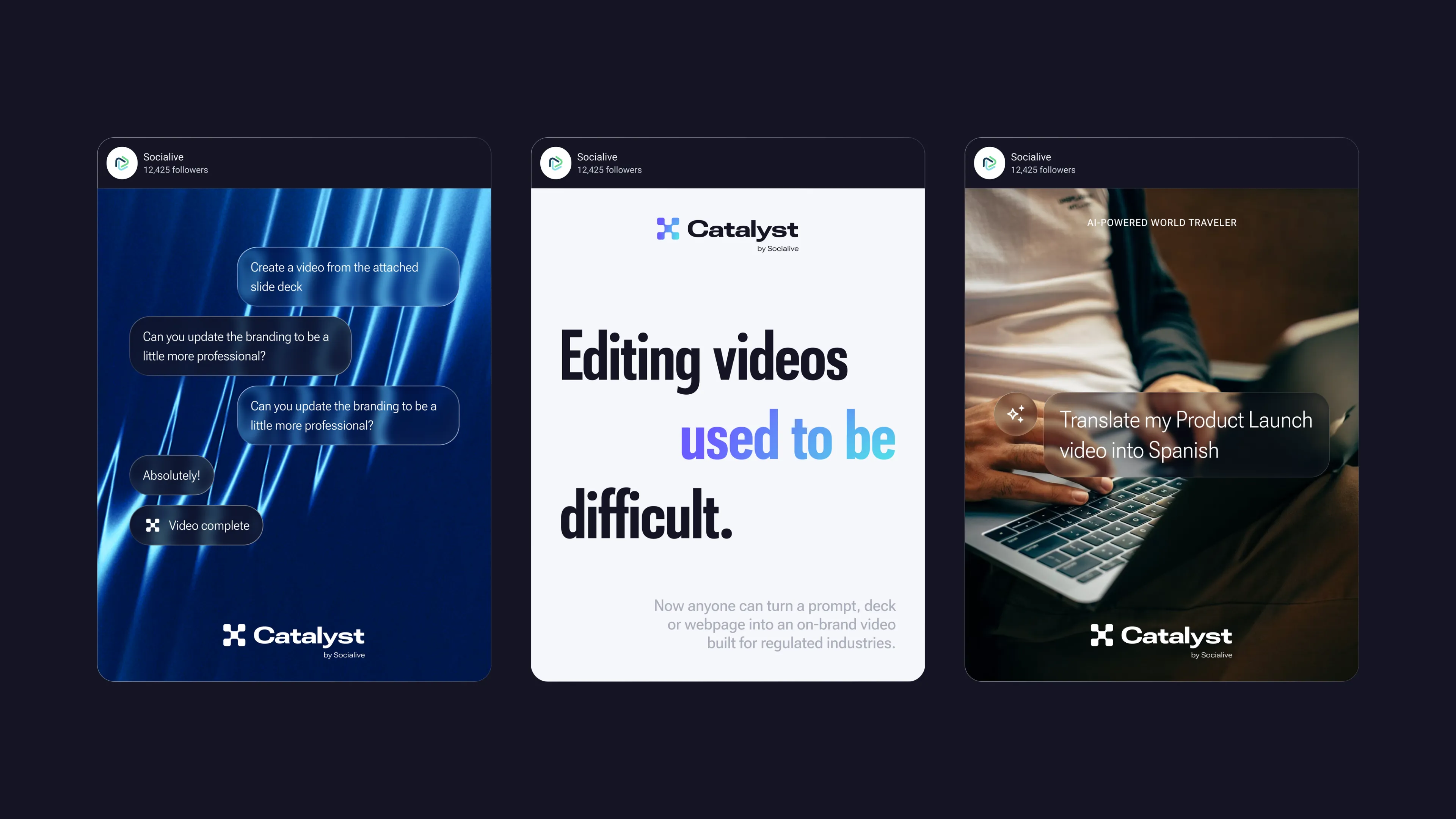
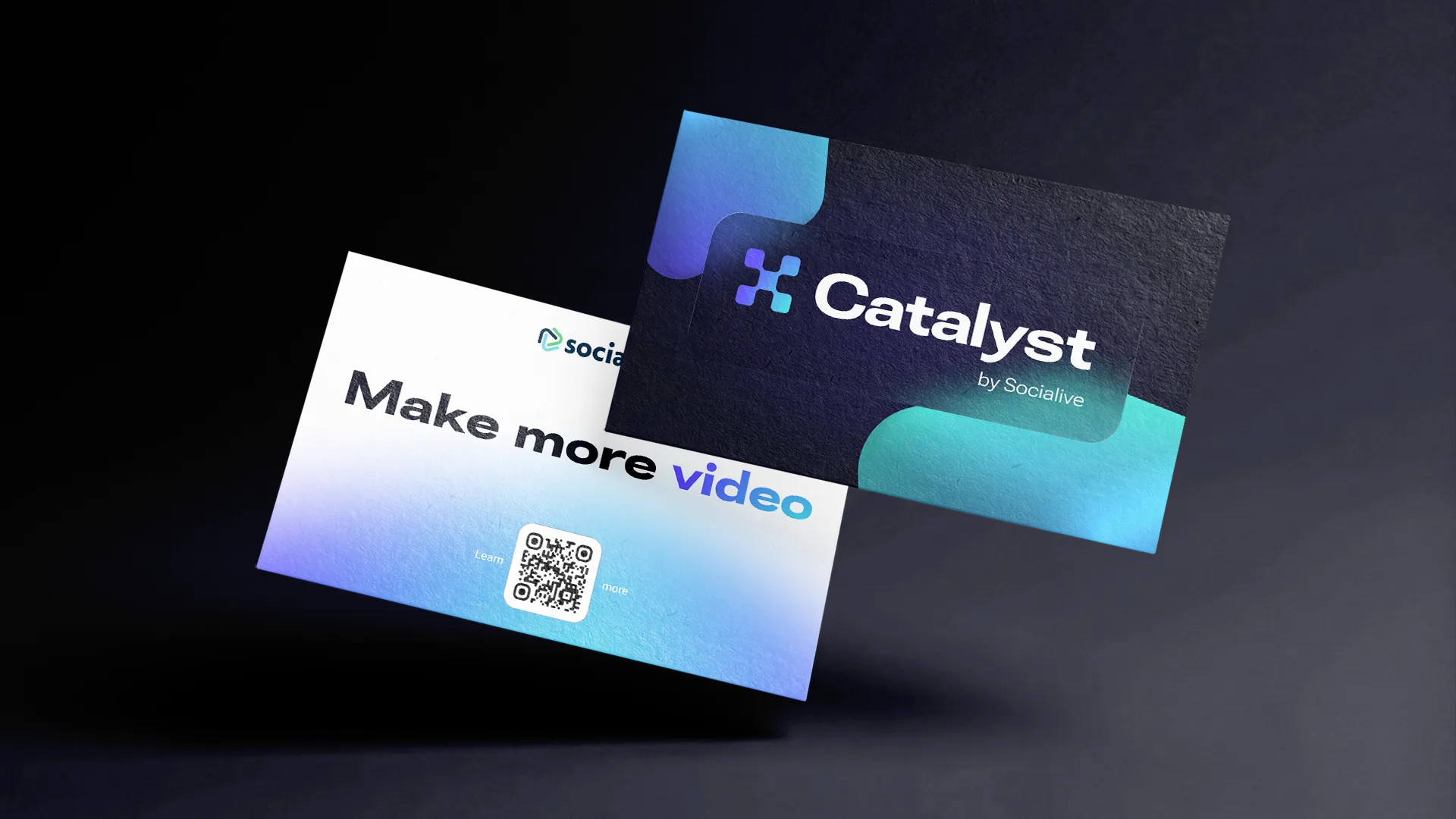
That alignment let us move directly into activation across social, the website, product, sales materials, live demos, and FutureProof Festival.

“Dude, I f***ing love it.”
Results
- One concept, one meeting. Approved by leadership with minimal changes.
- Five finalists, one clear direction. A structured process aligned leadership around the name.
- One extensible identity system. Built to support the product as its capabilities expand.
- Consistent brand activation. Extended across social, web, product, sales, and events.