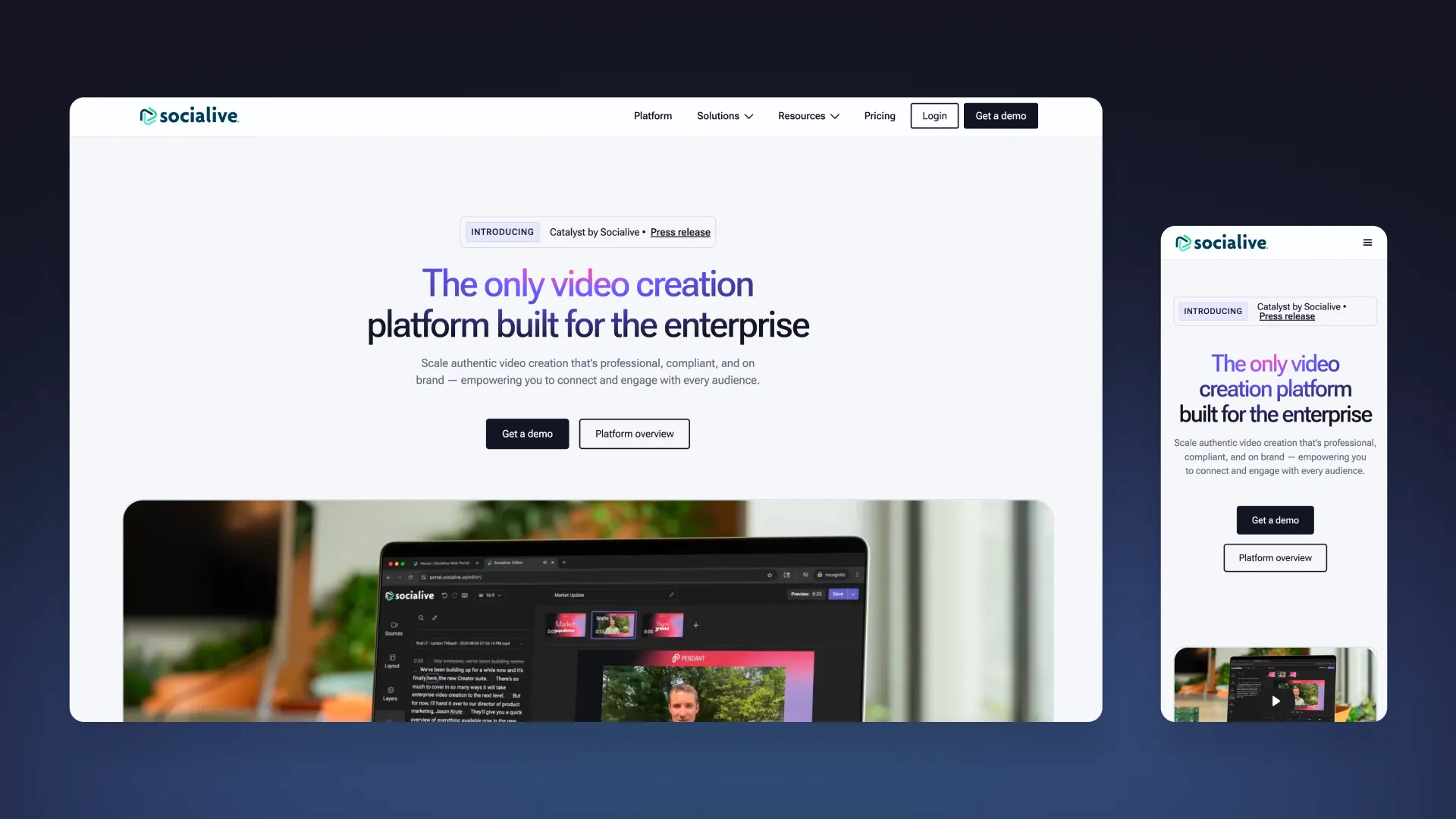
I rebuilt Socialive’s website around how enterprise buyers evaluate the platform, while giving marketing and product the autonomy to keep it current. See it live
- Team
- Design, Marketing, GTM, Sales
- Timeline
- May–September 2025
- Outcome
- A clearer enterprise buying experience, 30 legacy pages retired, and a self-serve publishing system for marketing and product.
The opportunity
Socialive’s product had evolved, but its website hadn’t. Overlapping pages, outdated messaging, and a slow publishing process made it harder to communicate the platform’s value and respond to change.
The goal was bigger than a redesign. The website needed to sell the product we had become and support the pace at which we were growing.
Structure before design
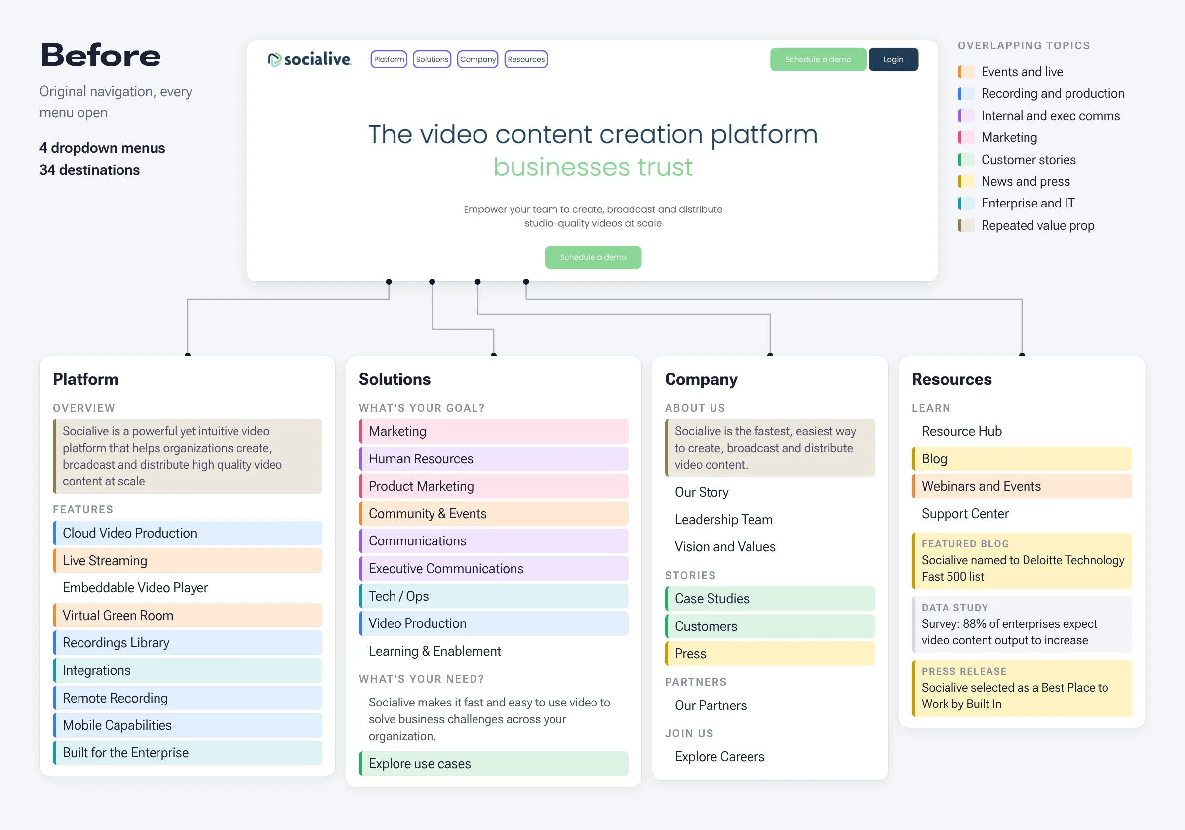
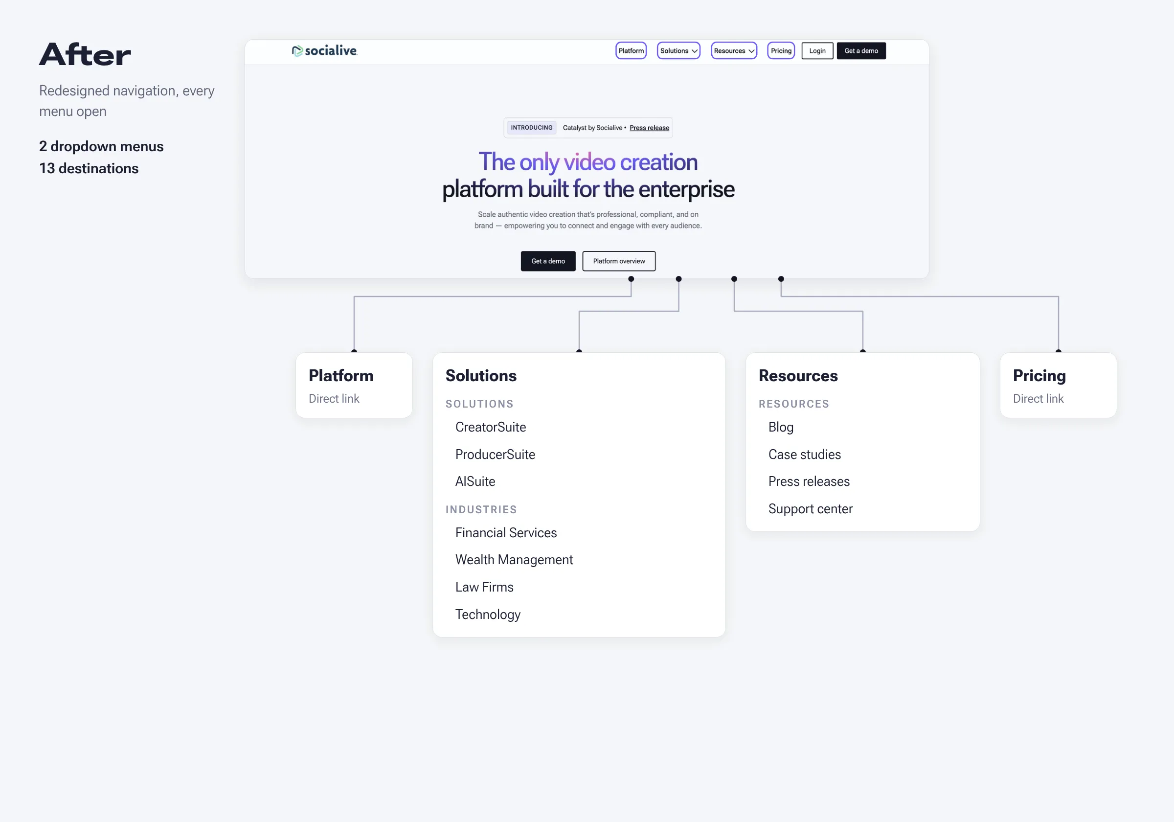
I started with the sitemap, not the visuals.
We separated launch-critical content from the longer-term backlog, focusing the first release on the pages that help buyers understand and evaluate Socialive: home, platform, solutions, resources, and pricing.
I retired 30 legacy pages, including nine solution pages and 21 use-case pages. This reduced duplication and gave the new site a clearer structure without letting the full backlog delay launch.
Designed around buyer needs
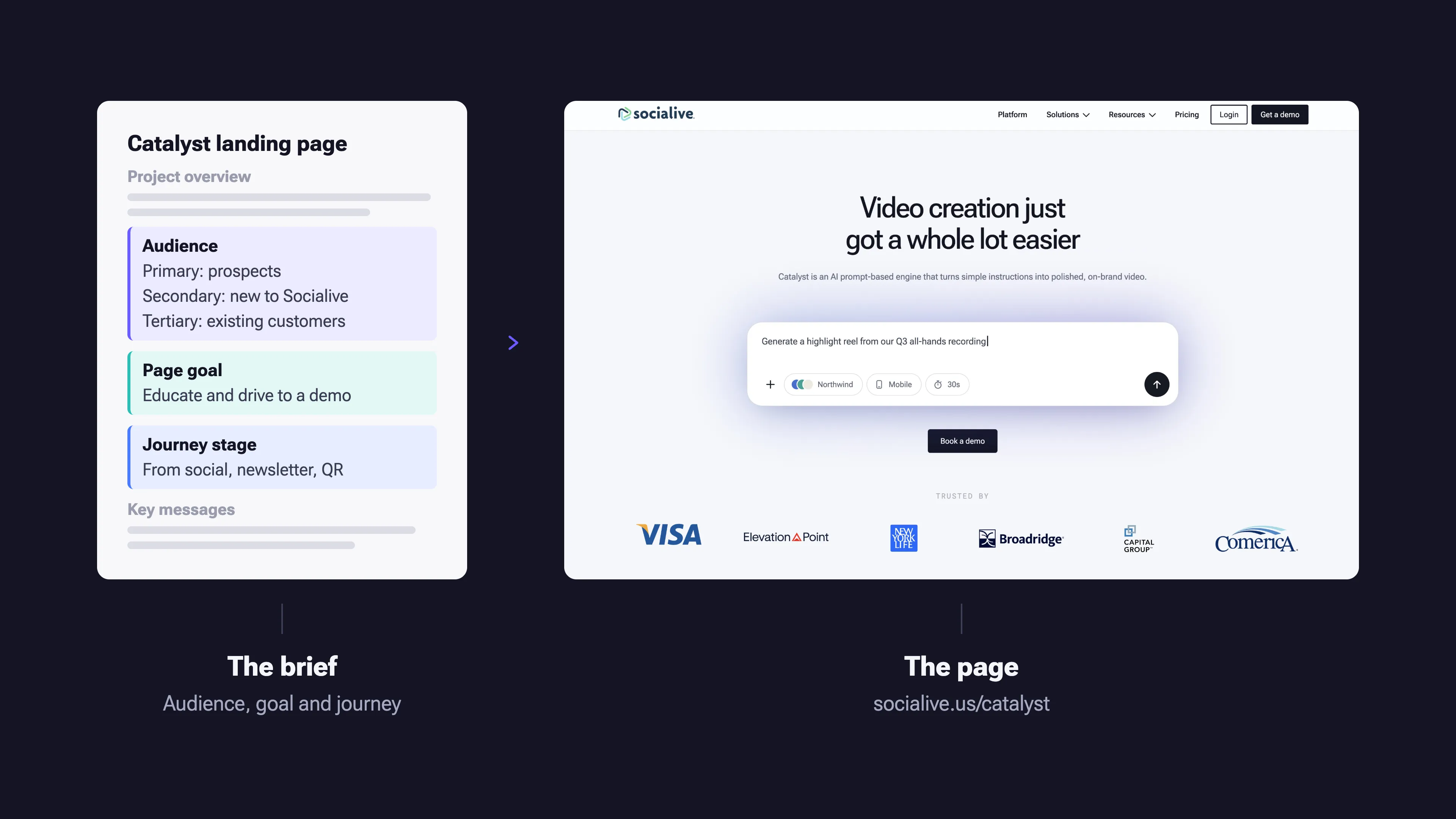
Every page started with a defined audience, goal, and place in the buying journey.
- Home: Why Socialive.
- Platform: What the platform does and how it fits together.
- Workflow pages: How teams use it to create and manage video.
- Industry pages: How Socialive addresses specific industry needs and search intent.
This gave each page a clear purpose, connecting business goals with what prospective customers were looking for.
Built to evolve
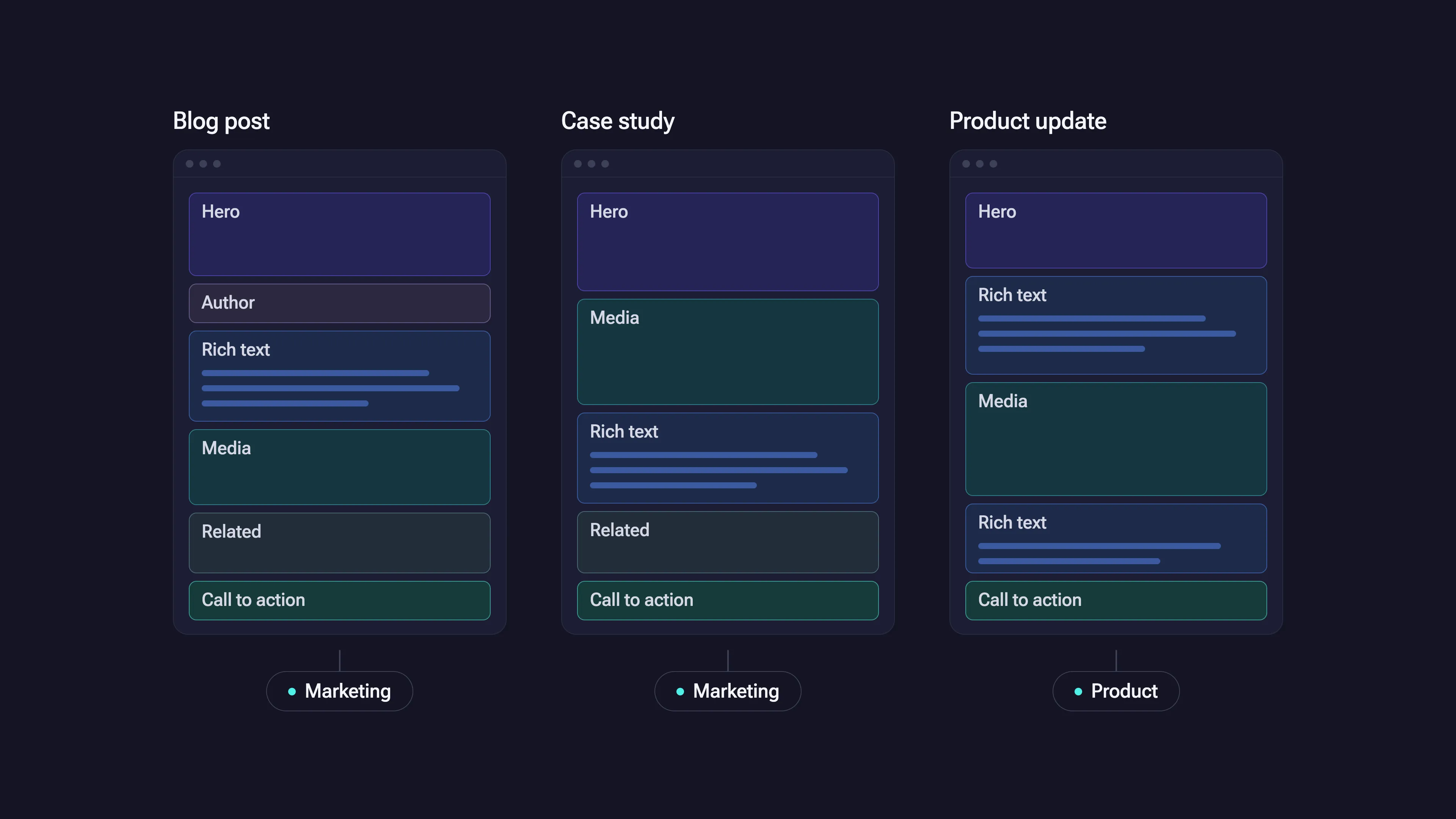
I moved the site from WordPress to Webflow and restructured the content model around how teams work.
Marketing could publish blogs and case studies. Product could share updates. Designers could build and ship new pages themselves, without a developer handoff. Reusable structures kept everything consistent without routing routine changes through engineering.
The result was a website the team could maintain and evolve alongside the product.
A brand that explains the platform
I brought the visual system and voice in line with Socialive’s enterprise positioning, using custom motion and interactions to support the experience.
The Catalyst page shows how this works in practice:
- Product demos built in code: Instead of static screenshots, animated walkthroughs show Catalyst turning a blog post, PDF, or website into a video, including the storyboard step where nothing is built until the user approves. Visitors can switch between use cases and pause at any point.
- Brand themes in motion: A sequence shows Catalyst reading brand guidelines, drafting a theme, and an admin publishing it, turning an abstract control into something buyers can watch work.
Because both are built in code rather than exported as video, they stay sharp, load fast, and can be updated as the product changes.
Impact and what’s next
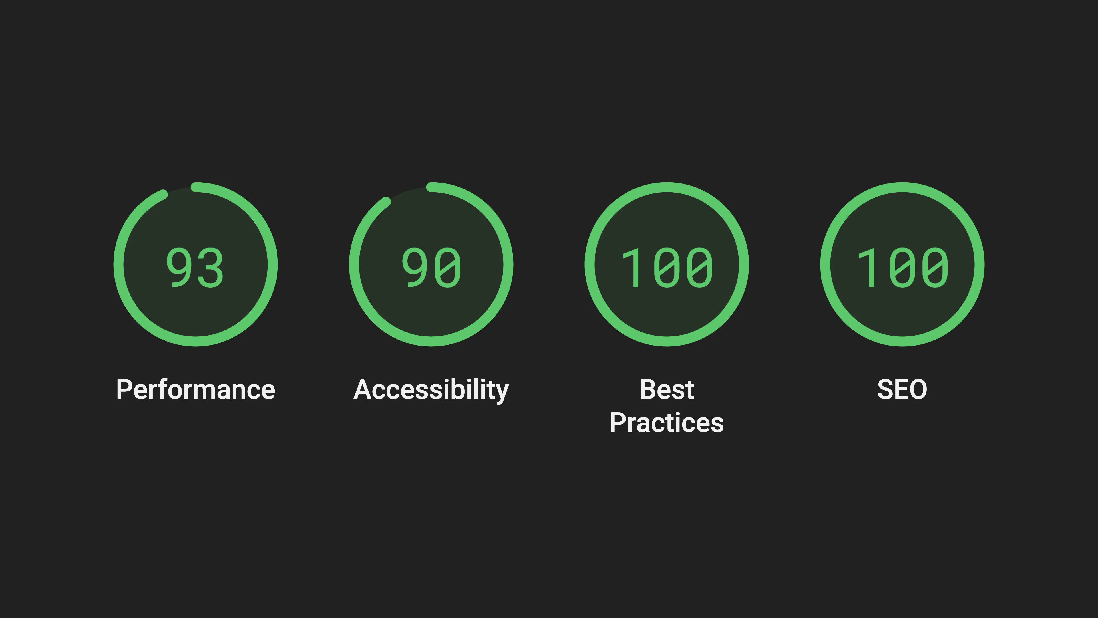
- Lighthouse: 100 for SEO, 100 for best practices, 93 for performance, 90 for accessibility.
- Clarity: 30 legacy pages retired.
- Autonomy: Self-serve publishing for marketing and product.
- Speed: 4.5 months from kickoff to launch.
The new site gave Socialive a clearer way to communicate its value and a more scalable system for keeping that story current.
Operational impact
- Democratized content publishing: Marketing, product, and design all publish directly, so the site improves continuously instead of waiting for a release.
- Sitewide changes from one place: The design system is tokenized, so a change to color, type, or spacing updates every page at once.
- New pages from existing parts: Templates and reusable components let the team assemble pages without starting from scratch.
- Engineering freed for the product: Routine site work no longer goes through engineering.
Since launch: Analytics, ongoing optimization, and the Catalyst product page.
Next: Building AI workflows that continuously improve performance and scale visual updates.