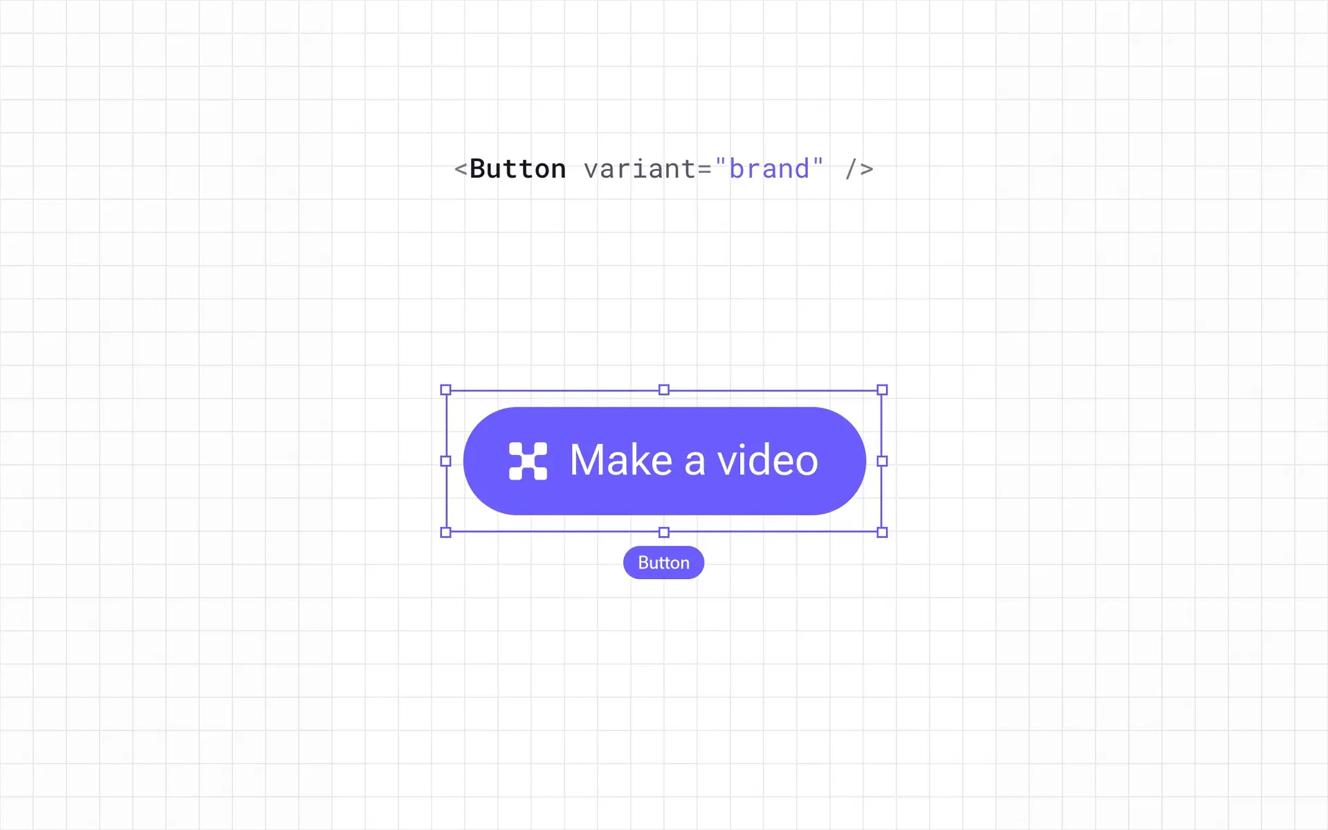
Product updates, new features and UX improvements at Socialive used to take months to get from design to production. I rebuilt how we design and ship software around a single source of truth in production code. Designers, product managers and engineers now build within shared guardrails, and the same work takes days.
- Role
- Led the system design, workflow and rollout
- Team
- 8 people across design, product and engineering use the workflow daily
- Timeline
- 2026 to present
- Outcome
- Production code is the source of truth for design, with automated checks for UI, UX and copy
The bottleneck was translation
Our designs lived as static mockups. Engineers rebuilt each one by hand, and every rebuild introduced small differences that led to another review. Most of our time went to handoffs, review cycles and revisiting decisions made months earlier. Even small UX improvements could take months to ship.
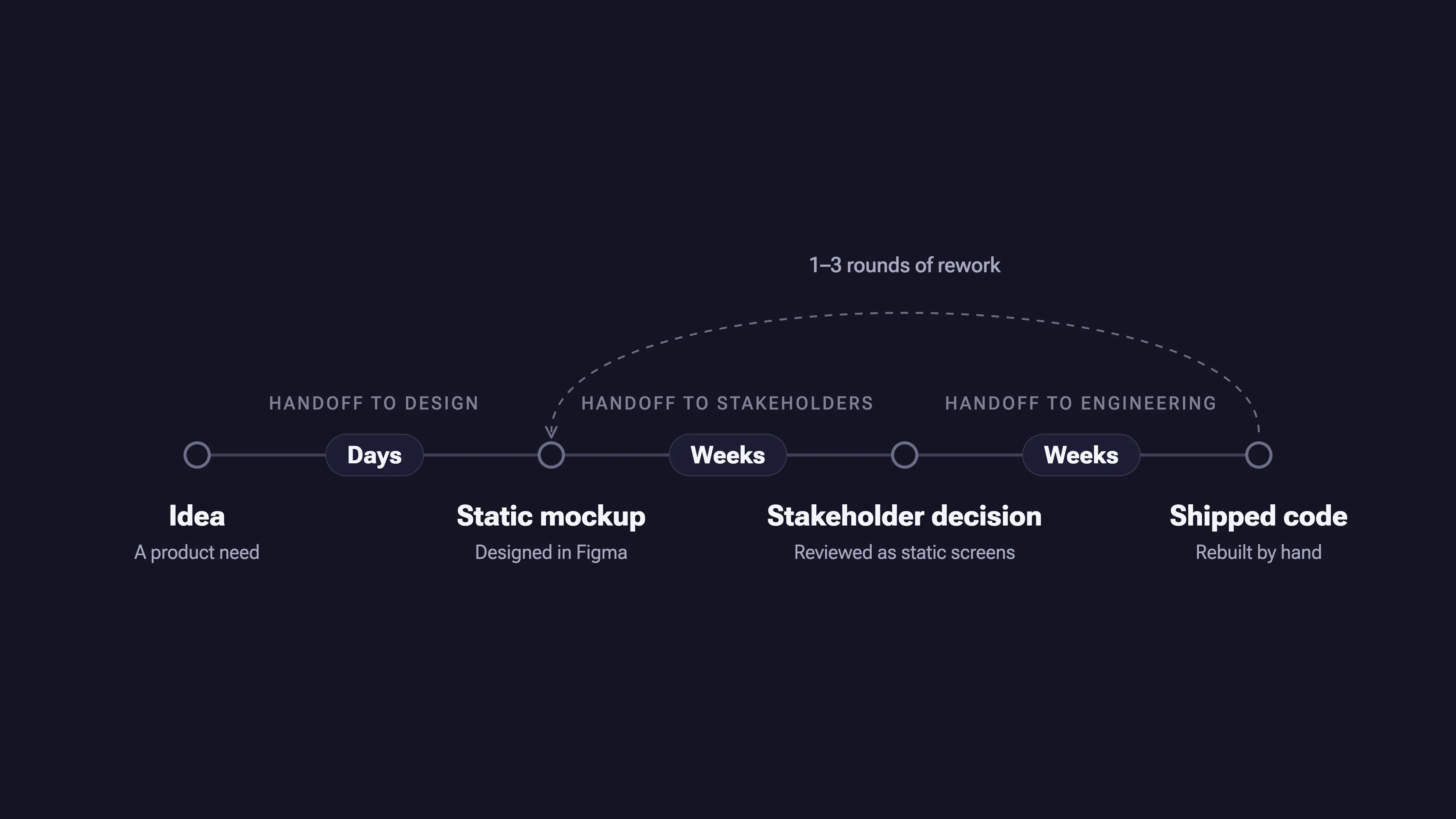
Removing the translation layer took three steps
Step 1: Prototypes in code
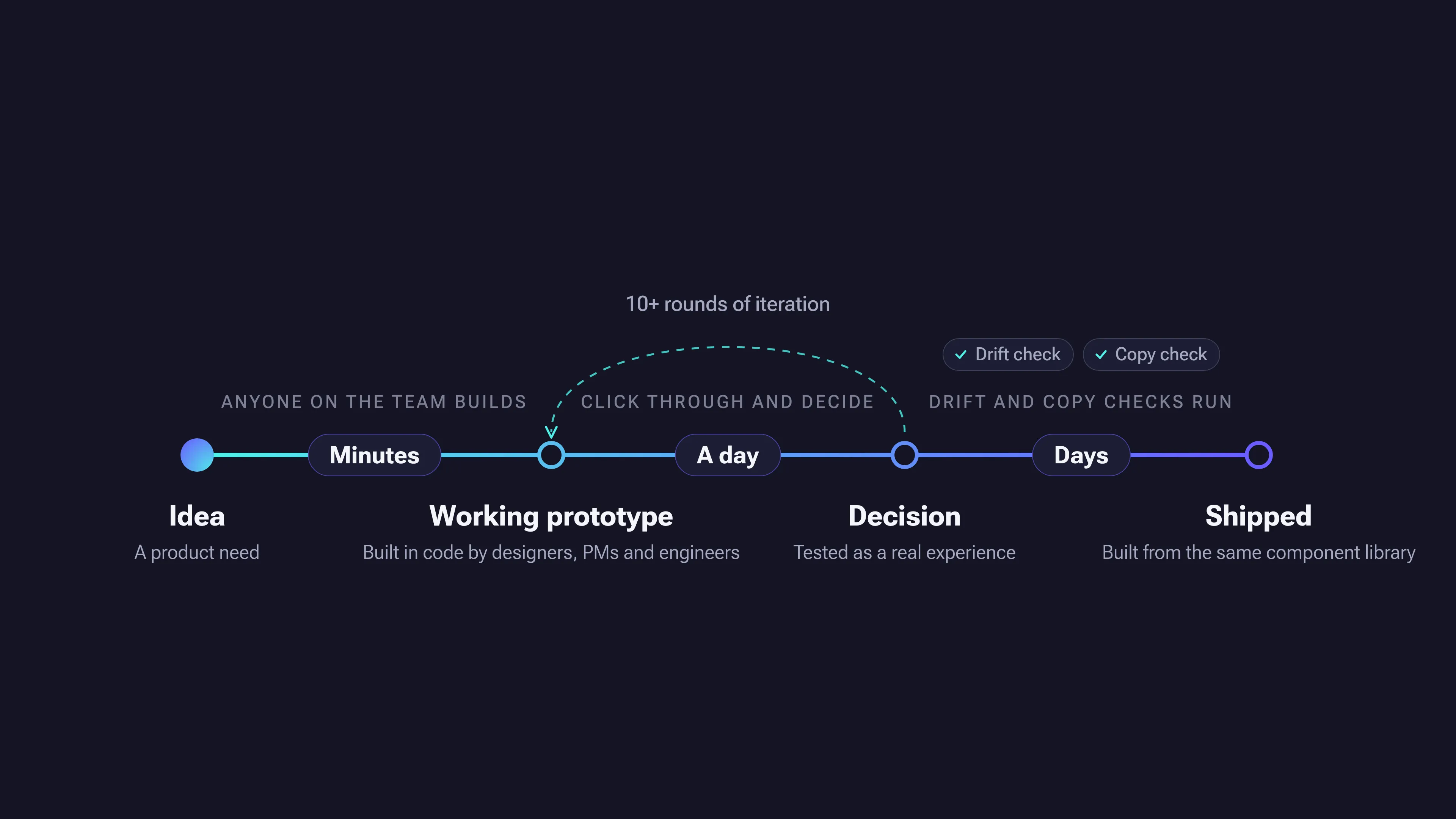
I moved prototyping out of static mockups and into code with Claude, starting with the Catalyst prototype. Stakeholders could click through real flows instead of reacting to pictures of them. Prototype creation went from days to minutes, iterations per feature went from 1 to 3 up to 10 or more, and design decisions that took weeks now take a day.

Step 2: Connecting the canvas
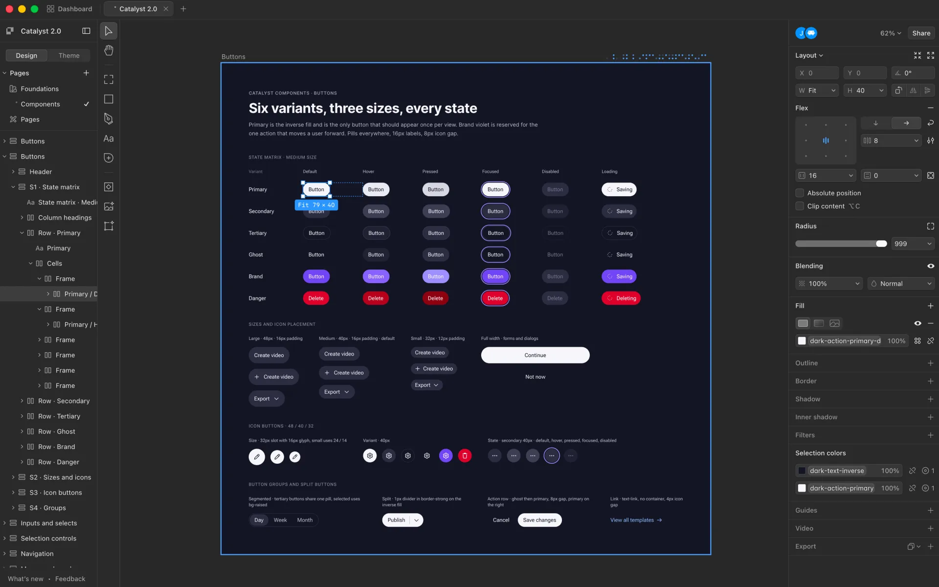
We adopted Paper, a design tool built on HTML and CSS, and connected it to Claude through its MCP server. Design and code shared tokens and components, which brought the canvas and the product much closer together. It still left us with two places to maintain.
Step 3: Code becomes the source of truth
We moved the source of truth into our React components in GitHub, because that is the layer closest to where AI writes code. An agent helps write components from our code tokens and primitives. Paper is still where we try quick visual ideas to work out what’s worth building. Once the code is written, the Paper file is regenerated from it and organizes itself: Approved design sections update, and earlier iterations move to an archive. Nobody spends time keeping design files up to date, and nothing is left to translate.
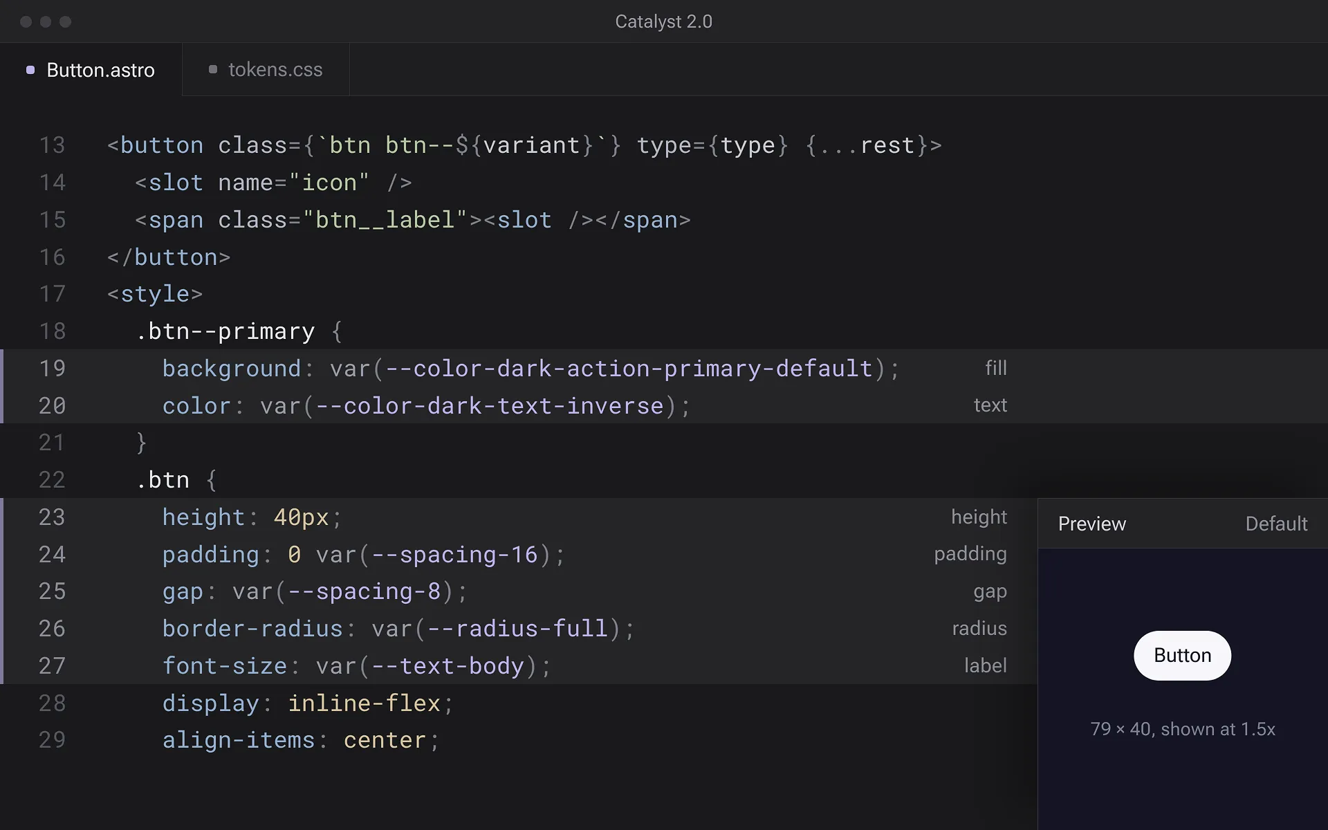
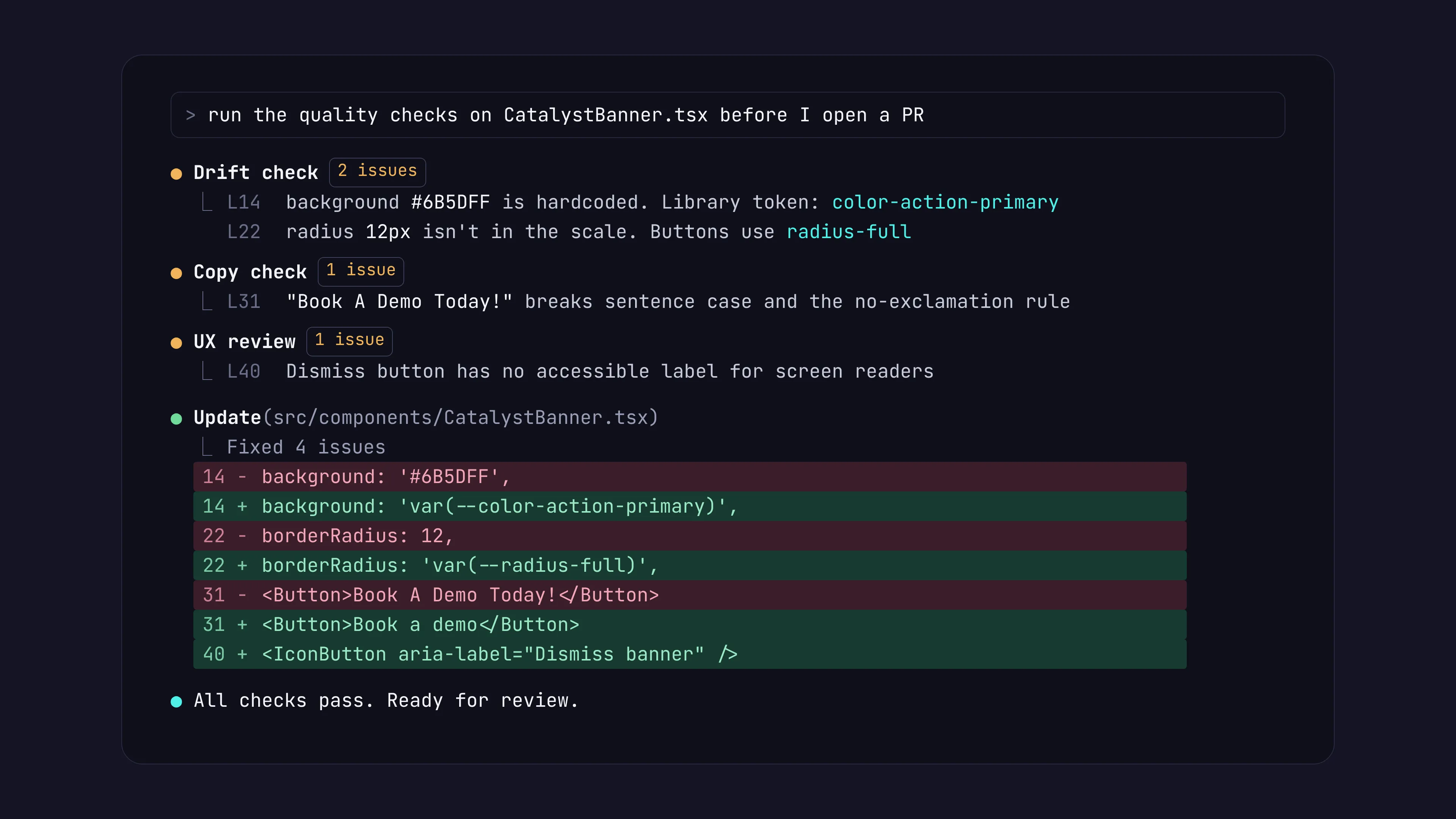
Design standards now run as part of the build
Designers still define the standards. Instead of enforcing them through review, we built them into the workflow:
- Shared design rules guide every component and screen the agent builds.
- A drift check flags anywhere design and code fall out of alignment.
- A copy check tests interface text against Socialive’s writing guidelines.
- A UX review catches usability and accessibility issues, like a button with no label for screen readers.
Designers, product managers and engineers all ship interface work directly
Engineering was hesitant at first, so adoption came from results rather than a mandate. Today 8 people across design, product and engineering use the workflow daily, and all of them prototype and implement interfaces with confidence. Designers ship their own UI changes instead of handing them off, and product managers and engineers no longer wait on design approval for every decision.
The design role has changed too. Our designers spend less time policing consistency and more time building it into the process. Instead of reviewing and refining every decision myself, I build systems that make good decisions easier for everyone.
Each tool has a defined role
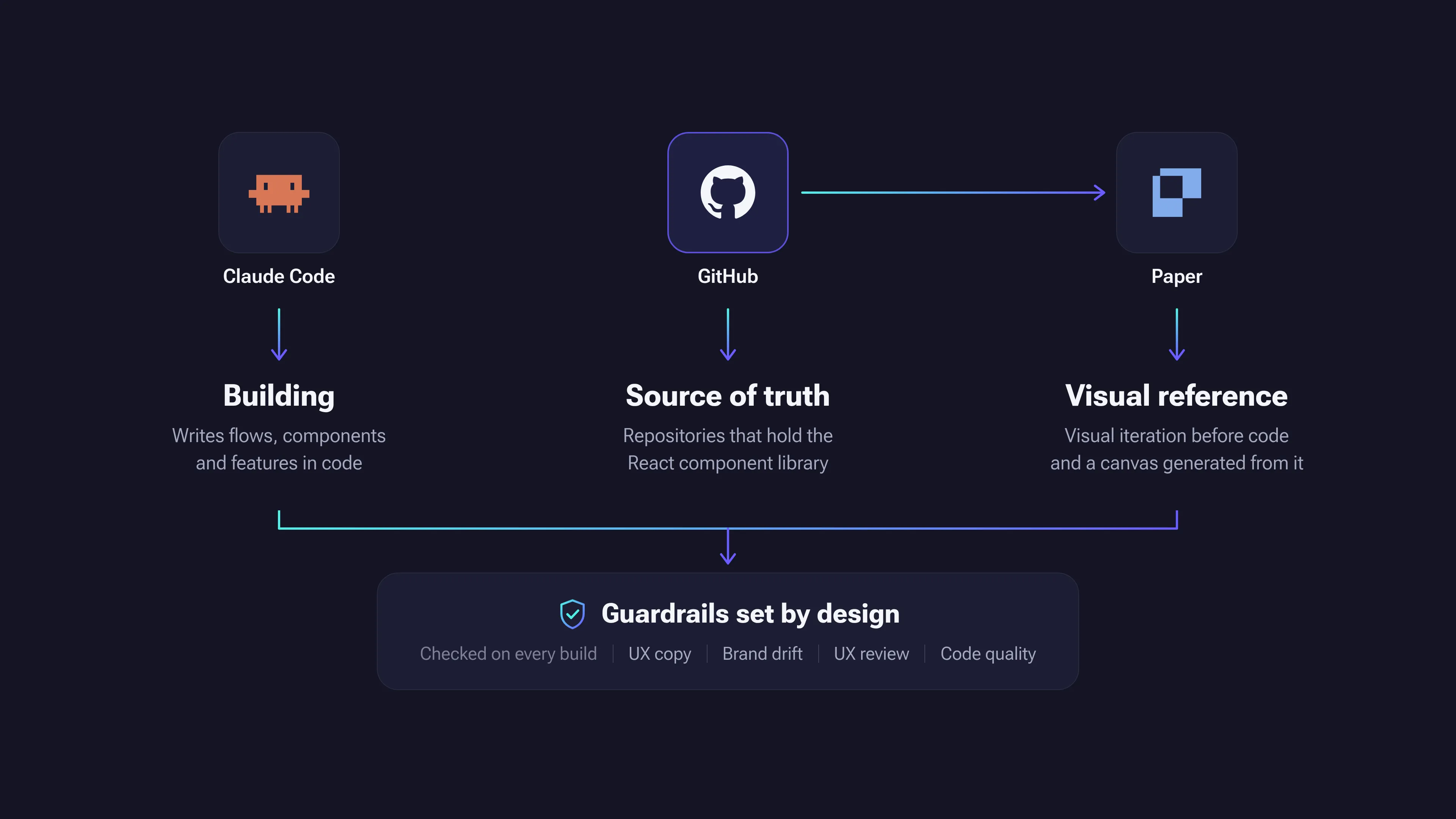
- Claude: Builds flows, components and features
- GitHub: Holds the React component library, the source of truth
- Paper: Quick visual iteration before code, then a canvas regenerated from the code once it’s written
- Automated checks: Drift and copy checks against our standards
Impact
- Product updates, new features and UX improvements: Months → days
- Prototype creation: Days → minutes
- Iterations per feature: 1 to 3 → 10+
- Design to decision: Weeks → 1 day
- People using the workflow daily: 8 across design, product and engineering
- Design files updated by hand: None. The canvas is generated from code.
Larger initiatives still take longer, and complexity and nuance haven’t gone away. What’s gone is most of the friction between design and code.
Part of a wider AI operations system
This workflow is one of several AI operations systems I’ve built at Socialive to help a small team work at a larger team’s scale. A case study on the wider AI operations work is coming soon.